2020
The Brewhouse, New Delhi
creative directors
Emilia Bergmans
Abhineet Singh
copy writer
Rohini Roy
Strategy, naming, concept identity and packaging directions for a new brand of locally sourced and sustainable bottled drinking water.
The Brewhouse, New Delhi
creative directors
Emilia Bergmans
Abhineet Singh
copy writer
Rohini Roy
Strategy, naming, concept identity and packaging directions for a new brand of locally sourced and sustainable bottled drinking water.
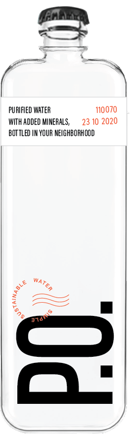
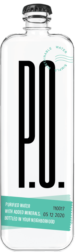


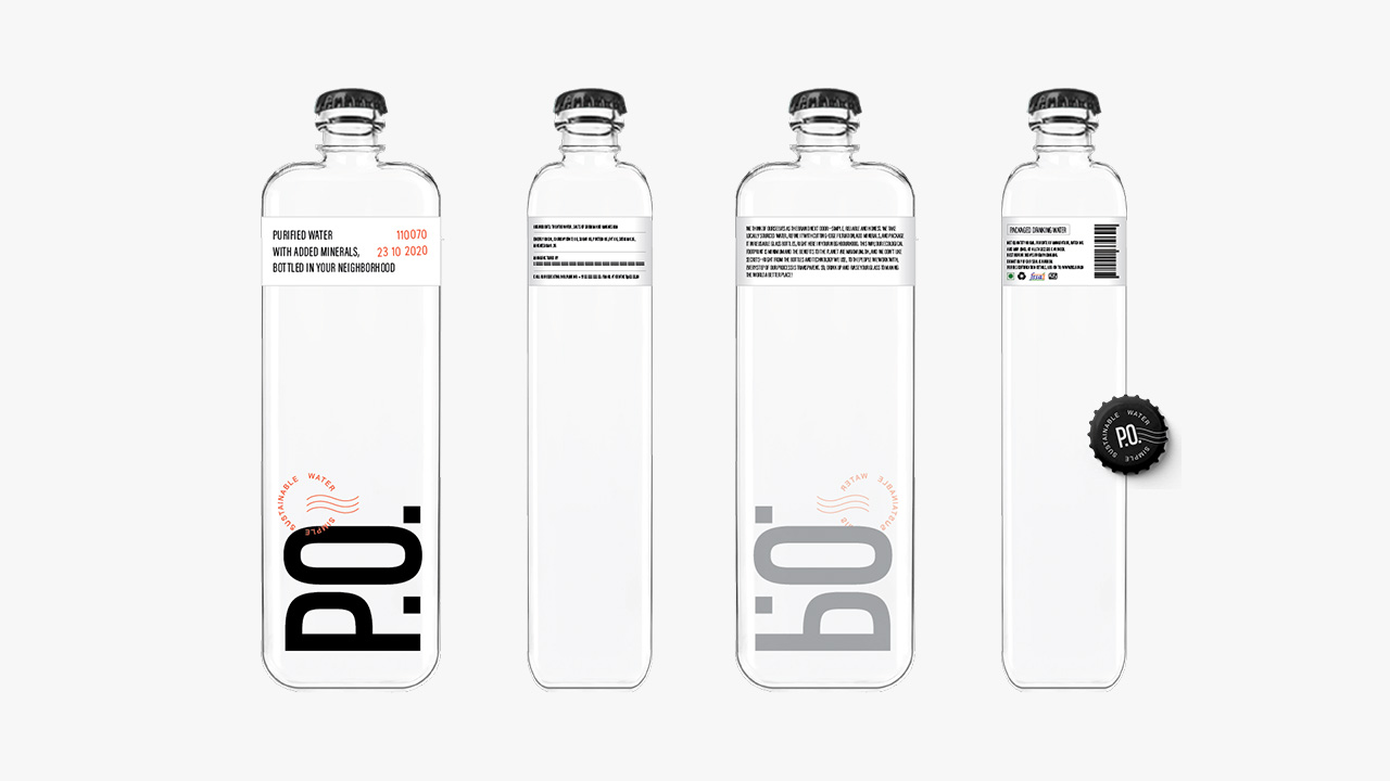
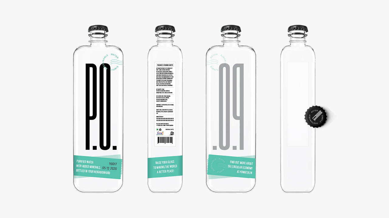
Direction One A
Short for post office and reminiscent of the Hindi word 'piyo' (drinking) when said out loud, the name P.O. uses the local pin code to tell consumers that this water is bottled within a kilometer.
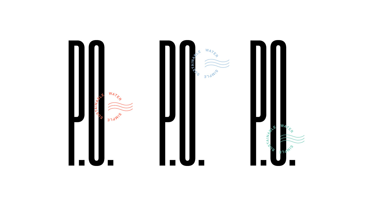
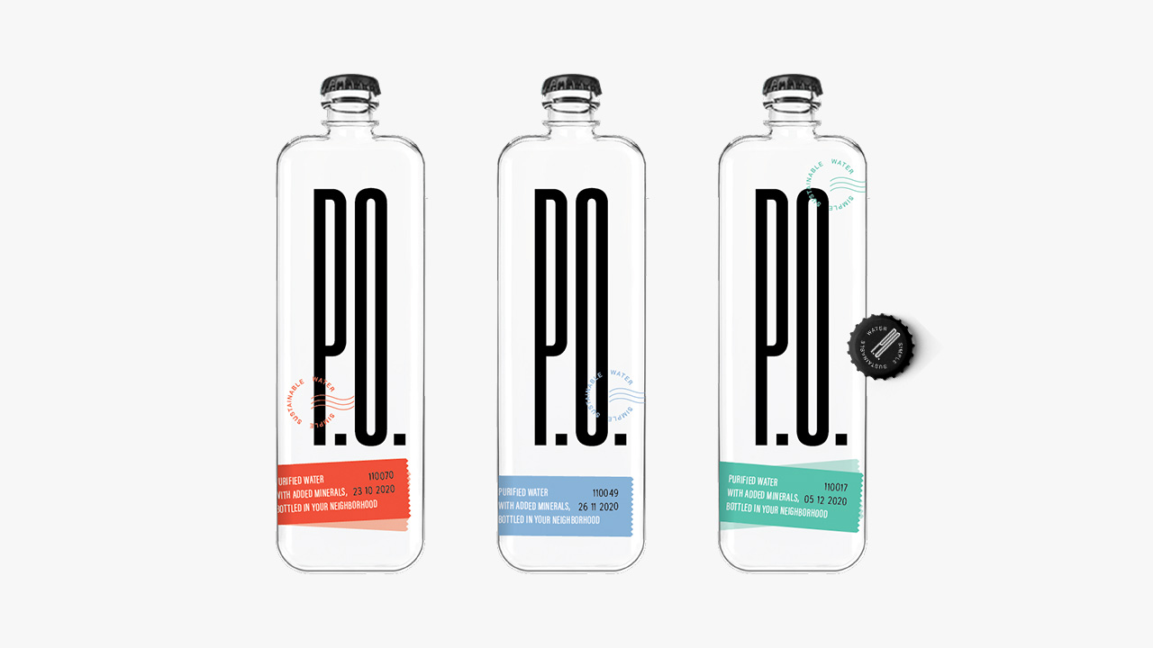
This direction leans into the postal aesthetic with a wavy water stamp.
Short for post office and reminiscent of the Hindi word 'piyo' (drinking) when said out loud, the name P.O. uses the local pin code to tell consumers that this water is bottled within a kilometer.
This direction leans into the postal aesthetic with a wavy water stamp.
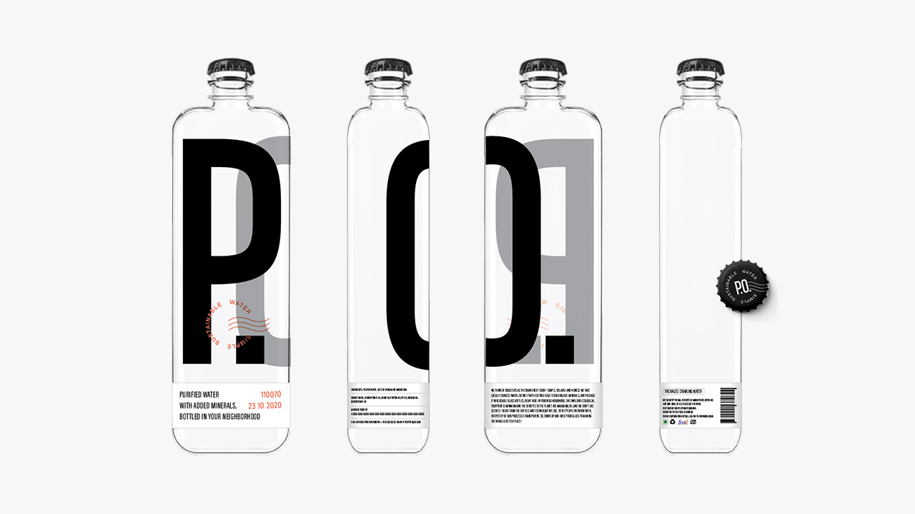
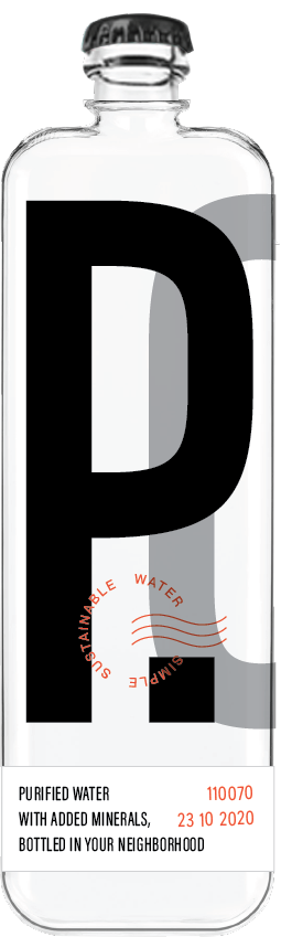
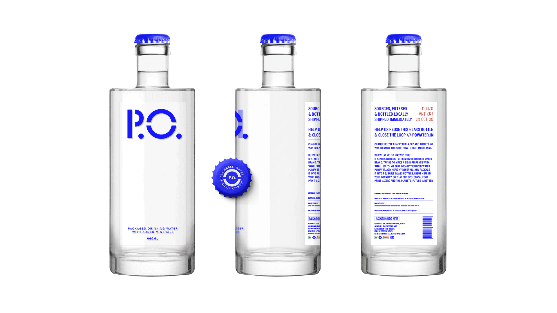
Direction One B
A more graphic variant with a super condensed wordmark.
This direction uses colour-coded stickers which are placed haphazardly, adding to the postal aesthetic and creating a sense of immediacy.
A more graphic variant with a super condensed wordmark.
This direction uses colour-coded stickers which are placed haphazardly, adding to the postal aesthetic and creating a sense of immediacy.
Direction Two
This direction would work with local artists to release a limited edition label series
every few months.
These can be themed around topics relevant to our brand promise, such as water, nature, sustainability and conservation.
This direction would work with local artists to release a limited edition label series
every few months.
These can be themed around topics relevant to our brand promise, such as water, nature, sustainability and conservation.
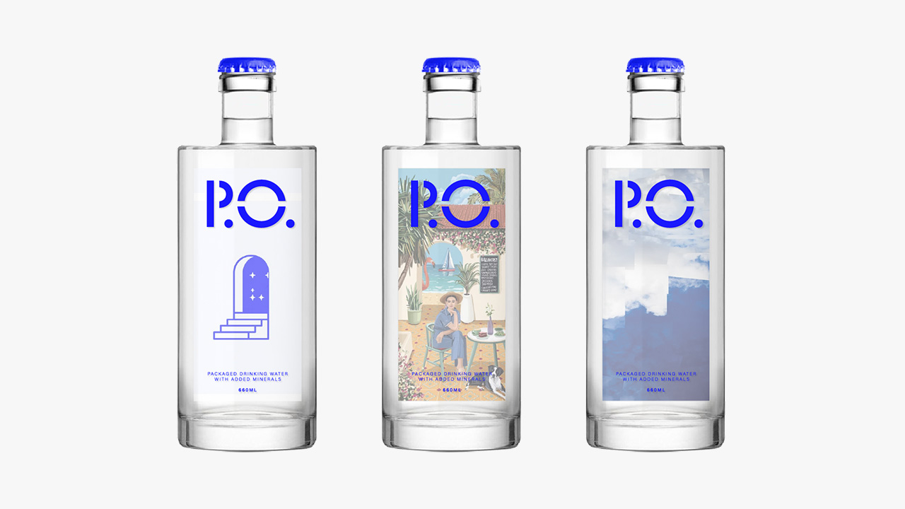
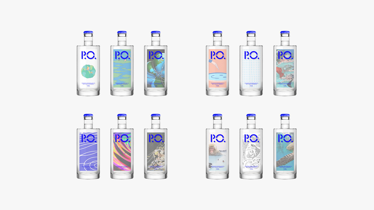
These design explorations use uncredited photographs found and admired on the world wide web. No copyright infringement intended.
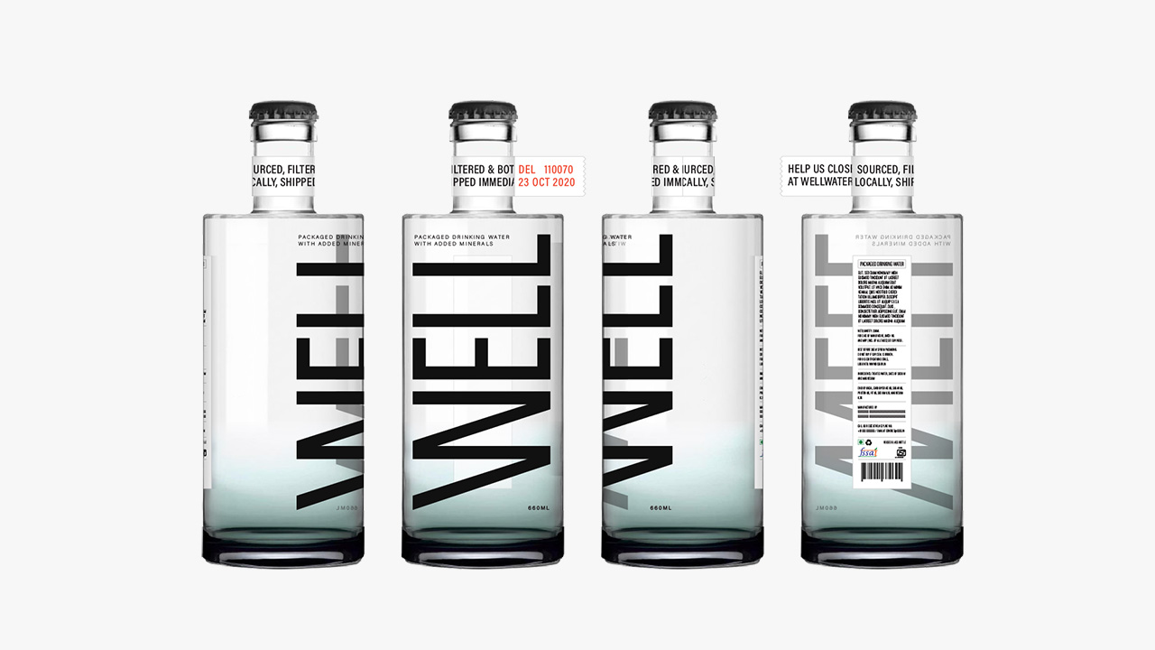
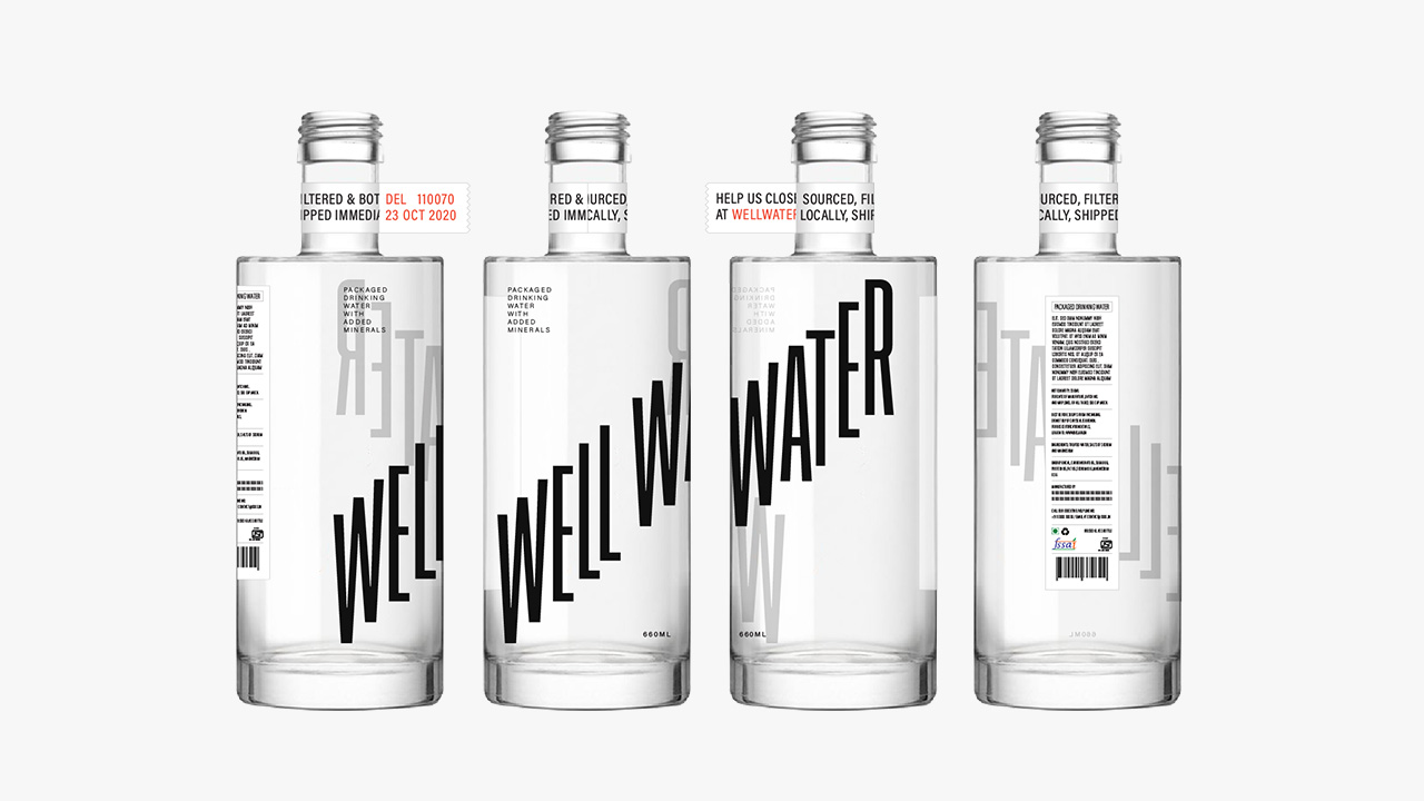
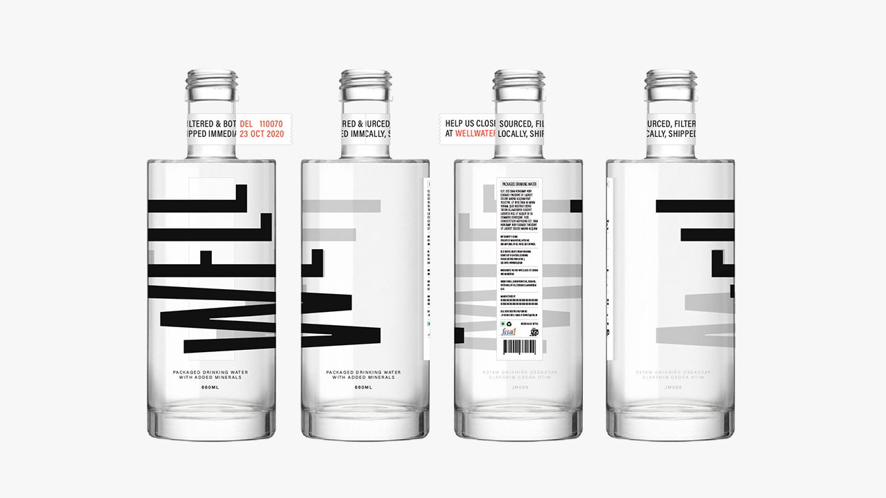
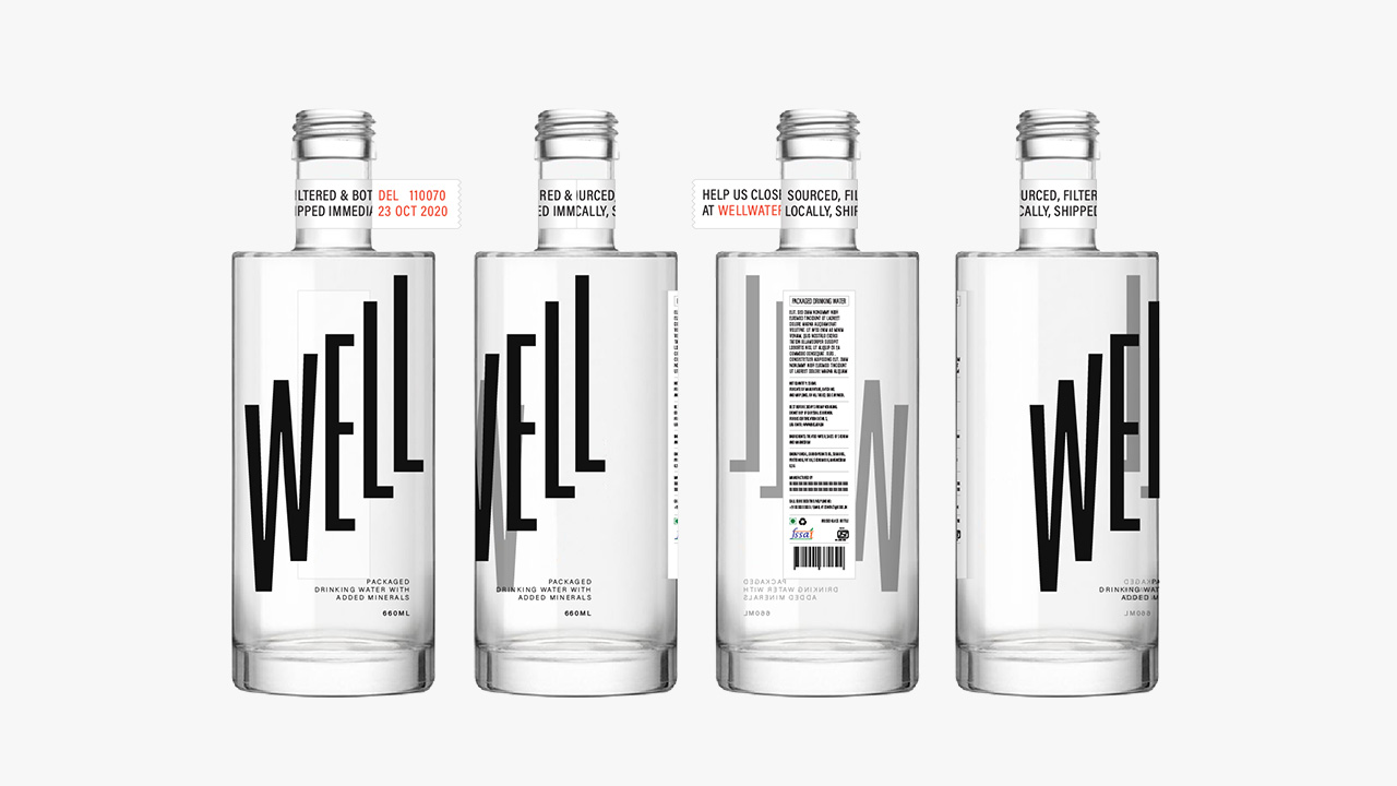
Direction Three
This direction is inspired by the stepwell, an iconic Indian monument that has continued to be an important resource for local communities.
This direction is inspired by the stepwell, an iconic Indian monument that has continued to be an important resource for local communities.